Web Friendly
Rebranding
or "How We Killed a Bee"
(in a good way)
Known for its coaching and consulting services, Web Friendly was founded by Matt Astifan in 2009. Eight years later, the company decided to move on from its old bee logo. The goals of this project were to affirm the image and personality that the company had developed since its inception, and create a style that would present the content creation and coaching aspects of the business as one harmonious whole.
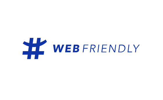
After some turbulent brainstorming and several iterations, a simple and unique symbol was born. A combination of the hash symbol and the shape of a smile, the Web Friendly "smiletag" is set in Egyptian Blue - a color that is vibrant, yet professional.

Each of Web Friendly's courses and books also got a fresh new look to match the style, while remaining unique and readily identifiable.
As the company made the leap to publish original content, a new site was designed from the ground up in order to accommodate blog posts, as well as sales pages.
The focus was on creating a minimalistic experience while staying true to the bold, vibrant and professional nature of the brand.
An important and unique solution was to place each blog post title in the header. This reduces clutter and focuses the reader's attention on the content.
How is your brand doing? Ready for an update, or just starting out?
We're here to create something that is truly yours.
Let's Talk